What are the central parts of any data-driven story, and how to apply the Gestalt laws to your data visualization reports? What role does context play in your data story? We are dwelling on these questions and providing you with a list of the best books and tools for stunning data visualization. Check it out!
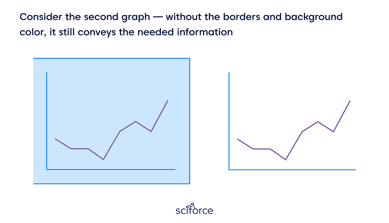
First, let us start from the central part of any good data story — the data-ink ratio. You’ve probably heard of or read something from Edward Tufte, the father of data visualization, who has coined the term. Thus, by saying data-ink ratio, we mean the amount of data-ink divided by the total ink needed for your visualization. Every element of your infographics requires a reason. Simply put, Tufte says that you should use only the required details and remove the visual noise.
How far could you go? Until your visualization communicates the overall idea. Daniel Haight calls it the visualization spectrum, the constant trade-off between clarity and engagement. Daniel proposes to measure the clarity by the time needed to understand the visualization, dependent on information density. Then, you can measure the engagement of your data story by the emotional connection it involves (besides the shares and mentions on social media).
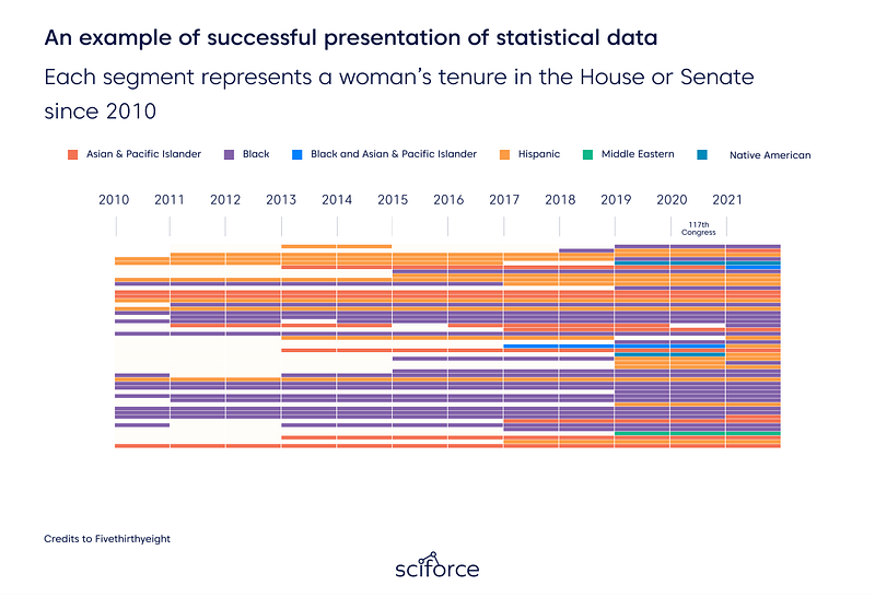
Take the data story by Fivethirthyeight about women of color at the US Congress as an example. Authors are using simple elements and not overloading the viewer with needle details (but still communicating the overall story crystal clear). At the same time, looking at timelines of different colors, you can see the drastic changes behind them. That is a pretty good compromise between clarity and engagement.
Edward Tufte also coined the term chartjunk, which stands for all the ugly visualization you may see endlessly online. 11 Reasons Infographics Are Poison And Should Never Be Used On The Internet Again by Walt Hickey, dated back by 2013, is still topical. Thus, it is better to follow the principles that never make infographics appear on the list.
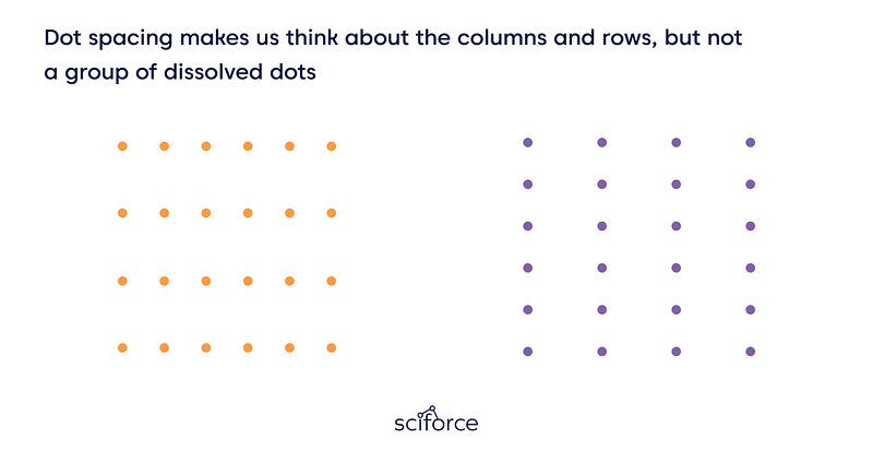
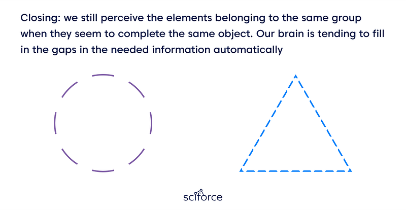
Gestalt principles are heuristics standing as the mental shortcuts for the brain and explaining how we group small objects to form the larger ones. Thus, we tend to perceive the things located close to each other as a group, and it is a principle of proximity.
Check out also post by Becca Selah, rich in quick and easy tips on clear data visualization.
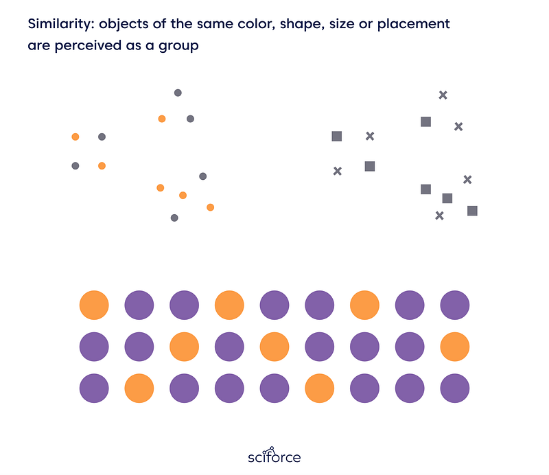
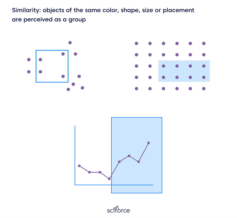
In essence, color conveys information in the most effective way for the human brain. But choosing it according to the rules might be frustrating. As a rule of thumb, remember that choosing a color of the same saturation helps a viewer to perceive such colors as a group.
Also, check out the excellent guide from Lisa Charlotte Rost (Datawrapper) since it is the best thing that we have seen for beginners looking for color-picking tools. Pro-tip: gray color is not fighting for human attention and should become your best friend. Andy Kirk tells more about it here.
Firstly, let us make it clear — a data visualization specialist is a data analyst. Thus, your primary task is to differentiate the signals from the noise, i.e., finding the hidden gems in tons of data. However, presenting your findings with good design in mind is not enough while no context is introduced to your audience. Here is when storytelling comes in handy.
What is your audience, and how will they see it? This question is relevant for both cases.
At the outset of your data-driven story, define your focus — is it a broad or narrow one? In the first case, you will spend lots of time digging into data, so it is crucial to ask your central question.
Working with a narrow focus is different. When you have some specific prerequisites at the very beginning and harness several datasets to find the answer, it is the case. Thus, it might be easier to cope with one specific inquiry than to look for some insights in datasets.
Consider placing simple insights at the beginning of your story. Thus, you draw in the reader immediately and add some relevant points to illustrate the primary idea better.
But when it comes to “well-it-depends-what-are-we-talking-about” answers, try to be mother-like, and careful with your audience. Guide them step-by-step into your story. You can use comparison within different elements of periods or apply analogies. Also, it is helpful to use individual data points on a small scale before delving into the large-scale story.
Besides the links to the datasets you have been working with while crafting your story, it is worth sharing your methodology. Thus, your savvy audience may be relaxed while looking at the results.
You may read tons of blogs on data visualization, but we believe in the old-fashioned style — build your stable foundation first with the classics. Thus, here is the list of ones that we recommend depending on the tasks you are solving.
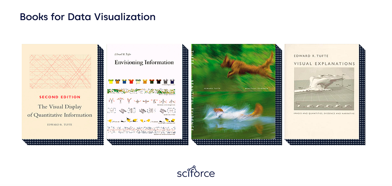
Edward Tufte is the father of data visualization, so we recommend starting with his books to master the main ideas.
The Visual Display of Quantitative Information, Envisioning Information, Beautiful Evidence, and Visual Explanation — You are a rock star of data visualization!
Naked Statistics: Stripping the Dread from the Data by Charles Wheelan. Applying statistics to your analysis is crucial, and you will delve into the principal concepts like inference, correlation, and regression analysis.
How Not to Be Wrong: The Power of Mathematical Thinking by Jordan Ellenberg. We recommend it for those who are coming to DataViz with a non-tech background.
Statistics Unplugged by Sally Caldwell. Again, statistics explained, since you will love it.
Interactive Data Visualization for the Web: An Introduction to Designing with D3 by Scott Murray comes in handy to create online visualization even if you have no experience with web development.
D3.js in Action: Data visualization with JavaScript by Elijah Meeks — a guide on creating interactive graphics with D3.
R for Data Science: Import, Tidy, Transform, Visualize, and Model Data by Hadley Wickham to brush up your coding skills with R.
Data Visualisation: A Handbook for Data Driven Design by Andy Kirk. This one can help you choose the best visualization for your data, as your insights should not be as clear as engaging, ideally.
Visualization Analysis and Design by Tamara Munzner. This one represents a comprehensive, systematic approach to design for DataViz.
Information Visualization: Perception for Design by Colin Ware is a cherry on the cake of your designing skills.
However, if you’ve got some tasks regarding data visualization right now and have no time for upskilling, we recommend online tools like Florish or Datawrapper. Mala Deep dwells on five free data visualization tools pretty clear, check it out! Also, we would appreciate your suggestions in the comments section!
Got inspired? Do not forget to clap for this post and give us some inspiration back!