
Stay informed and inspired in the world of AI with us.
 From Insights to Action: The Role of Predictive Analytics in Business Transformation
Predictive analytics uses historical data and techniques like statistical modeling and machine learning to predict future outcomes. It provides accurate forecasts, helping organizations predict trends and behaviors from milliseconds to years ahead. The global predictive analytics market was valued at 14.71 billion U.S. dollars in 2023 and is projected to grow from 18.02 billion U.S. dollars in 2024 to 95.30 billion U.S. dollars by 2032, with a compound annual growth rate (CAGR) of 23.1% during the forecast period (2024-2032). 80% of business leaders recognize that data is crucial for understanding operations, customers, and market dynamics. By combining historical data with predictive models, businesses gain a comprehensive view of their data, enabling real-time predictions and proactive responses to changing conditions. This article covers the basics of predictive analytics, how it works, its benefits, types of models, and key use cases in various industries. Predictive analytics enables organizations to identify patterns in data to detect risks and opportunities. By designing models that reveal relationships between various factors, organizations can assess the potential benefits or risks of specific conditions, supporting informed decision-making. Improved Decision-Making Provides detailed data-driven insights, such as customer buying patterns and market trends. Increased Efficiency Streamlines operations by identifying bottlenecks in production lines and optimizing supply chain logistics. Cost Reduction Identifies specific areas, like energy usage and inventory management, where costs can be cut without compromising the quality. Risk Management Detects potential risks, such as fraud in financial transactions or equipment failures in manufacturing. Enhanced Customer Experience Uses predictive insights to tailor marketing campaigns, recommend products, and customize services. Data Collection Historical data is collected from sources such as transaction records, customer interactions, and sensor data. Data Cleaning and Preparation The data is cleaned to remove errors, fill in missing values, and standardize formats, ensuring it is accurate and ready for analysis. Model Selection Based on the specific problem, an appropriate model, such as linear regression, decision trees, or neural networks, is selected. Model Training The chosen model is trained using historical data, enabling it to learn and identify patterns and relationships within the data. Model Testing The model is tested using a separate subset of data to evaluate its accuracy and performance, ensuring it can make reliable predictions. Deployment The trained model is deployed into the production environment to start making predictions on new incoming data. Monitoring and Refinement The model's performance is continuously monitored in real-time, and adjustments are made to improve its accuracy and adapt to new data trends. 1. Regression Models Regression models predict continuous outcomes based on historical data by identifying and quantifying relationships between variables. Walmart uses regression models to analyze past sales data, factoring in variables such as seasonal trends, holiday effects, pricing changes, and promotional campaigns. 2. Classification Models Classification models categorize data into predefined classes, making them useful for distinguishing between different types of data points. Gmail uses classification models to analyze incoming emails, considering sender address, email content, and user behavior to categorize emails as spam or regular messages. The model is trained on a large dataset of labeled emails to recognize patterns typical of spam. 3. Clustering Models Clustering models group similar data points together without predefined labels, helping to identify natural groupings within the data. Amazon uses clustering models to segment customers based on purchasing behavior, analyzing purchase history, browsing patterns, and product reviews. This allows Amazon to create targeted marketing campaigns with personalized recommendations and promotions for each customer group, such as frequent electronics buyers or regular book purchasers. 4. Time Series Models Time series models analyze data points collected or recorded at specific time intervals, useful for trend analysis and forecasting. Financial analysts at Goldman Sachs use time series models to analyze historical stock price data, including daily closing prices, trading volumes, and economic indicators, predicting its further movements for making informed investment decisions and recommendations. 5. Neural Networks Neural networks use layers of interconnected nodes to model complex relationships in data, particularly effective for pattern recognition and classification tasks. Google's DeepMind uses neural networks in its image recognition software to identify and classify objects within photos. For instance, in wildlife conservation projects, this software can analyze thousands of wildlife camera trap images, distinguishing between different species of animals such as lions, zebras, and elephants. 6. Decision Trees Decision trees use a tree-like model of decisions and their possible consequences, making them effective for classification and regression tasks. Netflix uses decision trees to recommend movies and TV shows by analyzing user data such as viewing history, ratings, and preferences. For instance, if a user likes action movies, the decision tree recommends similar action movies or related genres. Predictive analytics is transforming various industries by enabling organizations to make data-driven decisions and anticipate future trends. Here are some high-level examples of how predictive analytics is applied across different sectors. The Mayo Clinic uses predictive analytics to identify patients at high risk for chronic diseases such as diabetes and heart disease. By analyzing EHR data, genetic information, and lifestyle factors, the clinic can offer early interventions and personalized treatment plans. Another possible applications of predictive analytics in healthcare include: 1. Disease Prediction Identifies high-risk individuals for diseases like diabetes and cancer by analyzing patient history, genetics, and lifestyle to enable early intervention and reduce treatment costs. 2. Patient Readmission Estimate readmission likelihood, allowing targeted interventions like enhanced discharge planning and follow-up care. 3. Resource Management Optimizes patient admissions, staff schedules, and medical supplies. 4. Personalized Medicine Enables personalized treatments and better results by analyzing genetic data and treatment responses. 5. Clinical Decision Support Enhances diagnosis and treatment by providing evidence-based recommendations. 6. Population Health Management Identifies health trends, helping public health organizations develop targeted interventions and plan for disease outbreaks. Financial analysts at Goldman Sachs use time series models to analyze historical stock price data, including daily closing prices, trading volumes, and economic indicators, predicting its further movements for making informed investment decisions and recommendations. Here are more possibilities for predictive analytics in financial area: 1. Credit Scoring Predictive analytics assesses creditworthiness by analyzing credit history, transaction patterns, and financial behavior. 2. Fraud Detection Identify suspicious transactions and patterns, allowing to detect and prevent fraud in real-time. 3. Investment Strategies Helps to forecast market movements and optimize asset allocation by analyzing market trends, economic indicators, and historical data. 4. Risk Management Forecasts potential market, credit, and operational risks, helping to develop mitigation strategies, ensure regulatory compliance, and maintain stability. 5. Loan Default Prediction Estimate loan default likelihood by analyzing borrower profiles and economic conditions. 6. Market Trend Analysis Provides insights into market trends by analyzing historical data and economic indicators, helping to anticipate market shifts. Spotify applies predictive models to identify users who are likely to cancel their subscriptions. By analyzing listening habits, subscription history, and engagement metrics, Spotify can implement retention strategies to reduce churn. Their robust music recommendation system is also wide-known. Other opportunities include: 1. Customer Segmentation Groups customers based on behavior and preferences, enabling tailored marketing campaigns that increase engagement and conversion rates. 2. Churn Prediction Identify customers likely to leave, allowing companies to implement retention strategies and improve customer loyalty. 3. Sales Forecasting Provides accurate sales predictions, helping businesses manage inventory effectively and optimize marketing strategies. 4. Lead Scoring Evaluates and ranks leads based on their likelihood to convert, enabling sales teams to prioritize high-potential prospects and improve conversion rates. 5. Customer Lifetime Value (CLV) Prediction Estimate the future value of customers by analyzing purchase history and behavior, helping businesses focus on high-value customers and tailor long-term engagement strategies. 6. Campaign Optimization Assesses the effectiveness of marketing campaigns by analyzing response data and consumer interactions. Walmart uses predictive analytics to analyze purchasing data, identifying products that are likely to be popular during different seasons, such as summer apparel or winter holiday decorations. This allows Walmart to optimize inventory levels, ensuring that high-demand items are well-stocked and reducing the risk of stockouts or excess inventory. Here are more opportunities for predictive analytics in retail: 1. Demand Forecasting Predictive analytics forecasts future product demand, optimizing inventory levels to reduce stockouts and overstock situations. 2. Personalized Marketing Analyzes customer data to create tailored marketing campaigns, targeting customers with relevant offers and recommendations. 3. Price Optimization Determines optimal pricing strategies by analyzing market trends, competitor prices, and customer behavior. 4. Customer Segmentation Groups customers based on purchasing behavior and preferences for targeted marketing strategies and personalized shopping experiences. 5. Inventory Management Predictive analytics optimizes inventory management by forecasting demand and analyzing supply chain data. 6. Store Layout Optimization Analyzes shopping patterns and customer flow to optimize store layouts. Toyota implements predictive analytics to ensure product quality by analyzing real-time data from sensors on the production line. This includes data on temperature, pressure, and machinery vibrations. By monitoring these parameters, Toyota can detect early signs of equipment malfunctions or deviations from quality standards, allowing for immediate corrective actions. More opportunities for predictive analytics in manufacturing: 1. Predictive Maintenance Predictive analytics identifies potential equipment failures before they occur, enabling timely maintenance and reducing downtime. 2. Quality Control Monitors production processes to detect anomalies in real-time, ensuring consistent product quality. 3. Supply Chain Optimization Enhances supply chain efficiency by predicting demand, optimizing inventory levels, and reducing lead times. 4. Production Planning Forecasts production requirements and schedules, optimizing resource allocation and minimizing waste by aligning production output with market demand. 5. Energy Management Analyzes energy consumption patterns to optimize usage, reduce costs, and improve sustainability. 6. Workforce Management Predictive analytics forecasts labor needs based on production schedules and demand fluctuations. Our predictive analytics solutions have been used in different industries, showing how powerful and flexible machine learning can be in solving complex problems. Here are some examples that highlight the impact of our work. We developed a COVID-19 prediction tracker to calculate the risk of infection and the potential number of patients in specific locations within Israel. Our client aimed to help flatten the COVID-19 curve in Israel, a leader in vaccination efforts. We were tasked with predicting the spread and infection risk of COVID-19, facing challenges such as rapid disease spread, environmental changes, and the need for precise predictions at the city district level. Having neural networks and deep learning techniques in our arsenal, we took on the challenge: Recurrent Neural Networks (RNN) We used an artificial RNN, specifically long short-term memory (LSTM), to handle the dynamic nature of the pandemic and preserve long-term memory for time-series data related to infection rates. Data Normalization We managed to normalize data for both the beginning of the epidemic and real-time predictions, addressing statistical errors at different epidemic stages. Embedding Layers Added to the model to compress and represent city-specific data accurately, enabling the ML model to understand and predict interactions within the data. Risk Scale Development Created a risk scale (rating from 1 to 8) to detect the chances of infection in specific locations, using confirmed COVID-19 data and social behavior data. The solution provided precise predictions for epidemic development across Israel, offering accurate forecasts for around 300 towns and city districts. Specifically, the model accurately predicted infection rates with an error margin of less than 5%. The prediction accuracy improved public health responses, reducing infection rates by 20% in highly targeted areas We created a marketing forecasting solution for real estate businesses, increasing house sales by 16.5 times per month. One of our American real estate clients faced the problem of low sales. To address this, they decided to boost the number of estate buyers through ML-driven targeted advertising. We used historical sales data on transactions, loans, and estimated property values to build an ML model for highly targeted advertising: Data Usage Used ATTOM datasets (US nationwide property data) related to ownership status and seasonality to create a prediction model that accounted for sales fluctuations. Model Parameters Considered period of ownership, equity position, and actual residence for precise ad targeting, leading to significant sales growth. Enhanced Targeting Improved targeting with actual residence data, achieving remarkable increases in house sales. Robust Model Development Ensured the model's robustness and traceability using a decision tree classifier. The predictive model greatly improved ad targeting, increasing sales conversion by 16.5 times. To enhance personalized care, a client aimed to develop a treatment prediction solution using patient data from electronic health records (EHR) and electronic medical records (EMR), including detailed medical histories, genetic information, and lifestyle factors. The traditional “one-size-fits-all” treatment approach ignores crucial factors like age, gender, lifestyle, previous diseases, comorbidities, and genetics, making it hard to select optimal treatment plans. We sought to create a method to predict treatment outcomes using personalized data and machine learning (ML): Data Transformation Patient data, including medical histories, genetic information, and lifestyle factors, was standardized into a machine-readable format Cohort Definition We categorized treatment outcomes into "positive," "negative," and "no progress" classes. Model Development We developed and trained a machine learning algorithm using the processed patient data such as age, gender, medical history, genetic markers, and lifestyle habits. Implementation Integrated the trained model into the clinical workflow for ongoing predictions, providing real-time insights into potential treatment outcomes for individual patients. By leveraging detailed patient data, including medical histories, genetic information, and lifestyle factors, we achieved treatment success rates increasing by 25%, adverse reactions decreasing by 30%, and patient satisfaction scores improving from 80 to 96. Our ML service has two main purposes: forecasting and determining influencing factors on target data. As a forecasting tool, our autoML solution is versatile enough for other tasks like predicting sales or expenses. As driver service, the solution lets users test external and internal factors that influence their target data. The solution applies a pool of diverse models to the input data and selects the best one based on performance metrics. This approach ensures broad applicability and high accuracy. Key aspects of the technical implementation include:
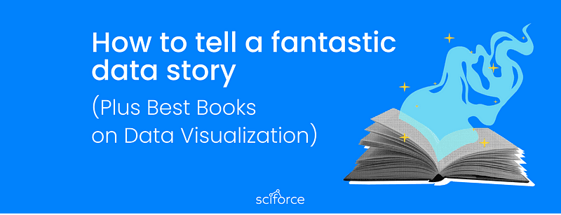 How to tell a fantastic data story (Plus Best Books on Data Visualization)
What are the central parts of any data-driven story, and how to apply the Gestalt laws to your data visualization reports? What role does context play in your data story? We are dwelling on these questions and providing you with a list of the best books and tools for stunning data visualization. Check it out! First, let us start from the central part of any good data story — the data-ink ratio. You’ve probably heard of or read something from Edward Tufte, the father of data visualization, who has coined the term. Thus, by saying data-ink ratio, we mean the amount of data-ink divided by the total ink needed for your visualization. Every element of your infographics requires a reason. Simply put, Tufte says that you should use only the required details and remove the visual noise. How far could you go?* Until your visualization communicates the overall idea. Daniel Haight calls it the **visualization spectrum**, the constant trade-off between **clarity** and *engagement. Daniel proposes to measure the clarity by the time needed to understand the visualization, dependent on information density. Then, you can measure the engagement of your data story by the emotional connection it involves (besides the shares and mentions on social media). Take the data story by _Fivethirthyeight_ about women of color at the US Congress as an example. Authors are using simple elements and not overloading the viewer with needle details (but still communicating the overall story crystal clear). At the same time, looking at timelines of different colors, you can see the drastic changes behind them. That is a pretty good compromise between clarity and engagement. Edward Tufte also coined the term chartjunk, which stands for all the ugly visualization you may see endlessly online. _11 Reasons Infographics Are Poison And Should Never Be Used On The Internet Again_ _by Walt Hickey,_ dated back by 2013, is still topical. Thus, it is better to follow the principles that never make infographics appear on the list. Gestalt principles are heuristics standing as the mental shortcuts for the brain and explaining how we group small objects to form the larger ones. Thus, we tend to perceive the things located close to each other as a group, and it is a principle of proximity. Check out also post by Becca Selah, rich in quick and easy tips on clear data visualization. In essence, color conveys information in the most effective way for the human brain. But choosing it according to the rules might be frustrating. As a rule of thumb, remember that choosing a color of the same saturation helps a viewer to perceive such colors as a group. Also, check out the excellent guide from Lisa Charlotte Rost (Datawrapper) since it is the best thing that we have seen for beginners looking for color-picking tools. Pro-tip: gray color is not fighting for human attention and should become your best friend. Andy Kirk tells more about it here. Firstly, let us make it clear — a data visualization specialist is a data analyst. Thus, your primary task is to differentiate the signals from the noise, i.e., finding the hidden gems in tons of data. However, presenting your findings with good design in mind is not enough while no context is introduced to your audience. Here is when storytelling comes in handy. What is your audience, and how will they see it? This question is relevant for both cases. At the outset of your data-driven story, define your focus — is it a broad or narrow one? In the first case, you will spend lots of time digging into data, so it is crucial to ask your central question. Working with a narrow focus is different. When you have some specific prerequisites at the very beginning and harness several datasets to find the answer, it is the case. Thus, it might be easier to cope with one specific inquiry than to look for some insights in datasets. Consider placing simple insights at the beginning of your story. Thus, you draw in the reader immediately and add some relevant points to illustrate the primary idea better. But when it comes to “well-it-depends-what-are-we-talking-about” answers, try to be mother-like, and careful with your audience. Guide them step-by-step into your story. You can use comparison within different elements of periods or apply analogies. Also, it is helpful to use individual data points on a small scale before delving into the large-scale story. Besides the links to the datasets you have been working with while crafting your story, it is worth sharing your methodology. Thus, your savvy audience may be relaxed while looking at the results. You may read tons of blogs on data visualization, but we believe in the old-fashioned style — build your stable foundation first with the classics. Thus, here is the list of ones that we recommend depending on the tasks you are solving. Edward Tufte is the father of data visualization, so we recommend starting with his books to master the main ideas. _The Visual Display of Quantitative Information_, _Envisioning Information,_ _Beautiful Evidence_, and _Visual Explanation_ — You are a rock star of data visualization! _Naked Statistics: Stripping the Dread from the Data_ by Charles Wheelan. Applying statistics to your analysis is crucial, and you will delve into the principal concepts like inference, correlation, and regression analysis. _How Not to Be Wrong: The Power of Mathematical Thinking_ _by_ Jordan Ellenberg. We recommend it for those who are coming to DataViz with a non-tech background. _Statistics Unplugged_ by Sally Caldwell. Again, statistics explained, since you will love it. _Interactive Data Visualization for the Web: An Introduction to Designing with D3_ by Scott Murray comes in handy to create online visualization even if you have no experience with web development. _D3.js in Action: Data visualization with JavaScript_ by Elijah Meeks — a guide on creating interactive graphics with D3. _R for Data Science: Import, Tidy, Transform, Visualize, and Model Data_ by Hadley Wickham to brush up your coding skills with R. _Data Visualisation: A Handbook for Data Driven Design_ by Andy Kirk. This one can help you choose the best visualization for your data, as your insights should not be as clear as engaging, ideally. _Visualization Analysis and Design_ by Tamara Munzner. This one represents a comprehensive, systematic approach to design for DataViz. Information Visualization: Perception for Design by Colin Ware is a cherry on the cake of your designing skills. However, if you’ve got some tasks regarding data visualization right now and have no time for upskilling, we recommend online tools like Florish or Datawrapper. Mala Deep dwells on five free data visualization tools pretty clear, check it out! Also, we would appreciate your suggestions in the comments section! Got inspired? Do not forget to clap for this post and give us some inspiration back!
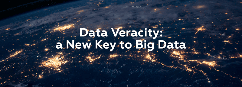 Data Veracity: a New Key to Big Data
In his speech at Web Summit 2018, Yves Bernaert, the Senior Managing Director at Accenture, declared the quest for data veracity that will become increasingly important for getting sense of Big Data. In short, Data Science is about to turn from data quantity to data quality. It is true, that data veracity, though always present in Data Science, was outshined by other three big V’s: Volume, Velocity and Variety. For Data Analysis we need enormous volumes of data. Luckily, today data is provided not only by human experts but by machines, networks, readings from connected devices and so on. It can be said that in most cases, we have enough data around us. What we need now is to select what might be of use. In the field of Big Data, velocity means the pace and regularity at which data flows in from various sources. It is important, that the flow of data is massive and continuous, and the data could be obtained in real time or with just a few seconds delay. This real-time data can help researchers make more accurate decisions and provide a fuller picture. For the data to be representative, it should come from various sources and in many types. At present, there are many kinds of structured and unstructured data in diverse formats: spreadsheets, databases, sensor readings, texts, photos, audios, videos, multimedia files, etc. Organization of this huge pool of heterogeneous data, its storage and analyzing have become a big challenge for data scientists. In most general terms, data veracity is the degree of accuracy or truthfulness of a data set. In the context of big data, it’s not just the quality of the data that is important, but how trustworthy the source, the type, and processing of the data are. The need for more accurate and reliable data was always declared, but often overlooked for the sake of larger and cheaper datasets. It is true that the previous data warehouse / business intelligence (DW/BI) architecture tended to spend unreasonably large amounts of time and effort on data preparation trying to reach high levels of precision. Now, with incorporation of unstructured data, which is uncertain and imprecise by definition, as well as with the increased variety and velocity, businesses cannot allocate enough resources to clean up data properly. As a result, data analysis is to be performed on both structured and unstructured data that is uncertain and imprecise. The level of uncertainty and imprecision varies on a case by case basis, so it might be prudent to assign a Data Veracity score and ranking for specific data sets. Sources of Data Veracity Data veracity has given rise to two other big V’s of Big Data: validity and volatility: Springing from the idea of data accuracy and truthfulness, but looking at them from a somewhat different angle, data validity means that the data is correct and accurate for the intended use, since valid data is key to making the right decisions. Volatility of data, in its turn, refers to the rate of change and lifetime of the data. To determine whether the data is still relevant, we need to understand how long a certain type of data is valid. Such data like social media where sentiments change quickly is highly volatile. Less volatile data like weather trends, is easier to predict and track. Yet, unfortunately, sometimes volatility isn’t within our control. Big data is extremely complex and it is still to be discovered how to unleash its potential. Many think that in machine learning the more data we have the better, but, in reality, we still need statistical methods to ensure data quality and practical application. It is impossible to use raw big data without validating or explaining it. At the same time, big data does not have a strong foundation with statistics. That is why researchers and analysts try to understand data management platforms to pioneer methods that integrate, aggregate, and interpret data with high precision. Some of these methods include indexing and cleaning the data that are used on primary data to give more context and maintain the veracity of insights. In this case, only trustworthy data can add value to your analysis and machine learning algorithms and the emphasis on its veracity will only grow with data sets growing in volume and variety.
 Hunting for Data: a Few Words on Data Scraping
No matter how intelligent and sophisticated your technology is, what you ultimately need for Big Data Analysis is data. Lots of data. Versatile and coming from many sources in different formats. In many cases, your data will come in a machine-readable format ready for processing — data from sensors is an example. Such formats and protocols for automated data transfer are rigidly structured, well-documented and easily parsed. But what if you need to analyze information meant for humans? What if all you have are numerous websites? This is the place where data scraping, or web scraping steps in: the process of importing information from a website into a spreadsheet or local file saved on your computer. In contrast to regular parsing, data scraping processes output intended for display to an end-user, rather than as input to another program, usually neither documented nor structured. To successfully process such data, data scraping often involves ignoring binary data, such as images and multimedia, display formatting, redundant labels, superfluous commentary, and other information which is doomed irrelevant. When we start thinking about data scraping the first and irritating application that comes to mind is email harvesting — uncovering people’s email addresses to sell them on to spammers or scammers. In some jurisdictions, it is even made illegal to use automated means like data scraping to harvest email addresses with commercial intent. Nevertheless, data scraping applications are numerous and it may be useful in every industry or business: Applications of Data Scraping The basic — and easiest — way to data scrape is to use dynamic web queries in Microsoft Excel, or install the Chrome Data Scraper plugin. However, for more sophisticated data scraping, you need other tools. Here we share some of the top data scraping tools: 1.* *Scraper API Scraper API is a tool for developers building web scrapers. It handles proxies, browsers, and CAPTCHAs so developers can get the raw HTML from any website with a simple API call. Pros: It manages its own and impressive internal pool of proxies from a dozen proxy providers, and has smart routing logic that routes requests through different subnets and automatically throttles requests in order to avoid IP bans and CAPTCHAs, so you don’t need to think about proxies. Drawback: Pricing starts from $29 per month. Cherio is the most popular tool for NodeJS developers who want a straightforward way to parse HTML. Pros: Drawback: Cheerio (and ajax requests) is not effective in fetching dynamic content generated by javascript websites. Scrapy is the most powerful library for Python. Among its features is HTML parsing with CSS selectors, XPath or regular expressions or any combination of the above. It has an integrated data processing pipeline and provides monitoring and extensive logging out of the box. There’s also a paid service to launch Scrapy spiders in the cloud. Pros: Drawback: Pros: Drawback: Pros: Drawback: Of course, it is not the best option for developers as it requires additional steps to import its output and does not provide the usual flexibility. Diffbot is different from most web scraping tools, since it uses computer vision instead of html parsing to identify relevant information on a page. In this way, even if the HTML structure of a page changes, your web scrapers will not break as long as the page looks the same visually. Pros: Thanks to its relying on computer vision, it is best suited for long running mission critical web scraping jobs. Drawback: For non-trivial websites and transformations you will have to add custom rules and manual code. Like all other aspects of Data Science, data scraping evolves fast, adding machine learning to recognize inputs which only humans have traditionally been able to interpret — like images or videos. Coupled with text-based data scraping it will turn the world of data collection upside down. Meaning that whether or not you intend to use data scraping in your work, it’s high time to educate yourself on the subject, as it is likely to go to the foreground in the next few years.
 High-Quality Software: to Pay or Not to Pay
Software development companies are always under pressure to launch their software onto the market faster, as releasing ahead of the competition gives advantage which can be vital. Fast release times and more frequent releases can, at the same time, corrupt the quality of the product, increasing the chances of defects and bugs. It is quite a common debate in software development projects to choose between spending time on improving software quality versus releasing more valuable features faster. The pressure to deliver functionality often cuts off time that can be dedicated to working on architecture and code quality. However, reality shows that high-performing IT companies can release fast (Amazon, for example, unfolds new software for production through its Apollo deployment service every 11.7 seconds) with 60 times fewer failures. So, do we actually need to choose between quality, time, and price? Software quality refers to many things. It measures whether the software satisfies its functional and non-functional requirements: Functional requirements specify what the software should do, including technical details, data manipulation, and processing, or any other specific function. Non-functional requirements, or quality attributes, include things like disaster recovery, portability, privacy, security, supportability, and usability. To understand the software quality, we can explore the CISQ software quality model that outlines all quality aspects and relevant factors to get a holistic view of software quality. It rests on four important indicators of software quality: Reliability – the risk of software failure and the stability of a program when exposed to unexpected conditions. Quality software should have minimal downtime, good data integrity, and no errors that directly affect users. Performance efficiency – an application’s use of resources and how it affects the scalability, customer satisfaction, and response time. It rests on the software architecture, source code design, and individual architectural components. Security – protection of information against the risk of software breaches that relies on coding and architectural strength. Maintainability – the amount of effort needed to adjust software, adapt it for other goals or hand it over from one development team to another. The key principles here are compliance with software architectural rules and consistent coding across the application. Of course, there are other factors that ensure software quality and provide a more holistic view of quality and the development process. Rate of Delivery – how often new versions of the software are shipped to customers. Testability – finding faults in software with high testability is easier, making such systems less likely to contain errors when shipped to end-users. Usability – the user interface is the single part of the software visible to users, so it’s crucial to have a great UI. Simplicity and task execution speed are two factors that facilitate better UI. User sentiment – measuring how end-users feel when interacting with an application or system helps companies get to know them better and incorporate their needs into upcoming sprints and ultimately broaden your impact and market presence. Continuous improvement – implementing the practice of constant improvement processes is central to quality management. It can help your team develop its own best practices and share them further, justify investments, and increase self-organization. There are obviously a lot of aspects that describe quality software, however, not all of them are evident to the end-user: a user can tell if the user-interface is good, an executive can assess if the software is making the staff more efficient. Most probably, users will notice defects or certain bugs and inconsistencies. What they do not see is the architecture of the software. Software quality can thus fall into two major categories: external* (such as the UI and defects) and *internal (architecture): a user can see what makes up the high external quality of a software product, but cannot tell the difference between higher or lower internal quality. Therefore, a user can judge whether to pay more to get a better user interface, since they can assess what they get. But users do not see the internal modular structure of the software, let alone judge that it's better, so they might be reluctant to pay for something that they neither see, nor understand. And why should any software-developing company put time and effort into improving the internal quality of their product if it has no direct effect? When users do not see or appreciate extra efforts spent on the product architecture, and the demand for software delivery speed continues to increase along with the demand for reduction in costs, companies are tempted to release more new features that would show progress to their customers. However, it is a trap that reduces the initial time spent and the cost of the software but makes it more expensive to modify and upgrade in the long run. One of the principal features of internal quality is making it easier to figure out how the application works so developers can add things easily. For example, if the software is divided into separate modules, you can read not the whole bunch of code, but look through a few hundred lines in a couple of modules to find the necessary information. More robust architecture – and therefore, better internal quality, will make adding new features easier, which means faster and cheaper. Besides, software's customers have only a rough idea of what features they need in a product and learn gradually as the software is built - particularly after the early versions are released to their users. It entails constant changing of the software, including languages, libraries, and even platforms. With poor internal quality, even small changes require developers to understand large areas of code, which in turn is quite tough to understand. When they perform changes, unexpected breakages happen, leading to long test times and defects that need to be fixed.Therefore, concentrating only on external quality will yield fast initial progress, but as time goes on, it gets harder to add new features. High internal quality means reducing that drop off in productivity. But how can you achieve high external and internal quality when you don't have endless time and resources? Following the build life cycle from story to code on a developer desktop could be an answer.While performing testing, use automation through the process, including automated, functional, security, and other modes of testing. This provides teams with quality metrics and automated pass/fail rates. When your most frequent tests are fully automated and only manual tests on the highest quality releases left, it leads to the automated build-life quality metrics that cover the full life cycle. It is enabling developers to deliver high-quality software quickly and reduce costs through higher efficiency. Neglecting internal quality leads to rapid build-up of work that eventually slows down new feature development. It is important to keep internal quality high in the light of having control, which will pay off when adding features and changing the product. Therefore, to answer the question in the title, it is actually a myth that high-quality software is more expensive, so no such trade-off exists. And you definitely should spend more time and effort on building robust architecture to have a good basis for further development – unless you are just working on a college assignment that you’ll forget in a month.
